
Suite-Wide Report Builder
Turning a reporting tool only the most technical users touched into something everyday enterprise users can pick up.
The Challenge
Custom report creation was one of our most frequent client workflows. Whether someone was tracking overdue invoices for a vendor or pulling hiring data, reports let them build the lists we didn't ship out of the box. The catch was that the legacy tool was so complex, it was basically reserved for the most technical users. Everyone else either dug through walkthrough documentation or handed it off to someone who knew.
What I Found
I spent weeks auditing the legacy reporting system and mapping out user flows to see where people got stuck. Almost all of the friction came from three places: confusing technical jargon, no guidance up front, and poor error prevention. You configured everything, ran it, and found out afterward whether you got it right.
I also had a major constraint: the reporting engine underneath wasn't changing, so every improvement had to happen in the interface.
The Explorer
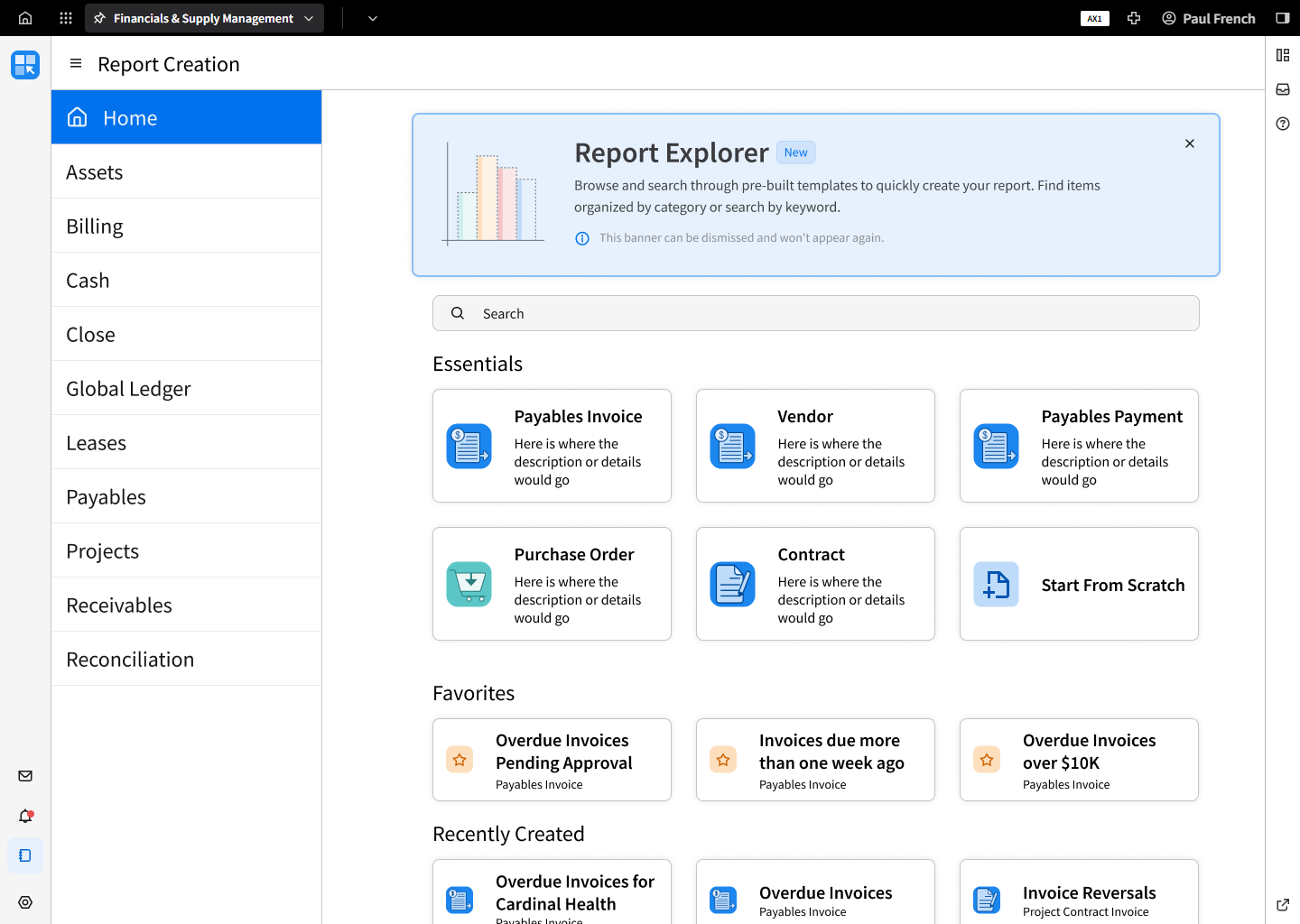
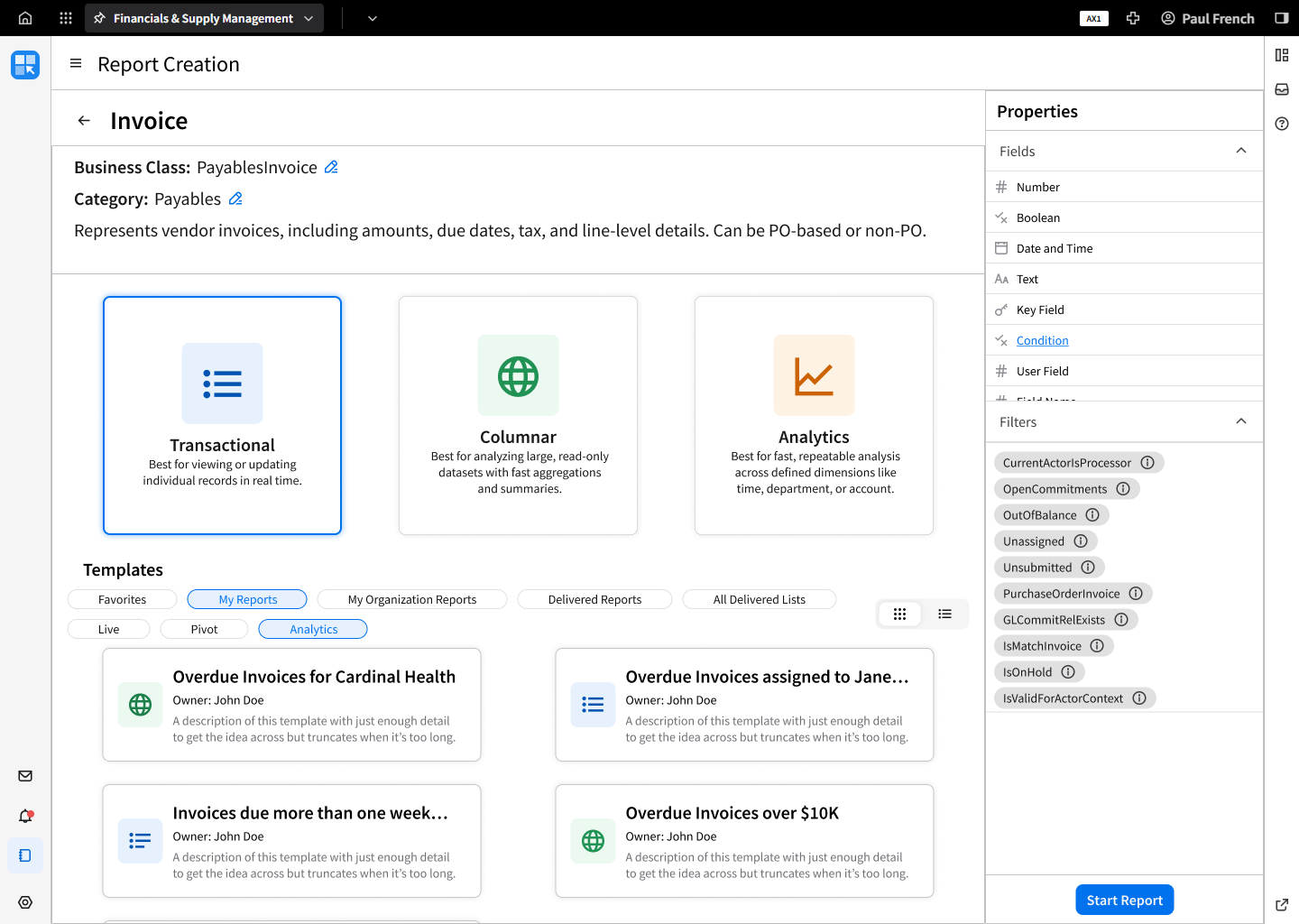
The lack of upfront guidance hit hardest at the very start. You had to know which business class held your data before you could even begin. So I designed the Report Explorer, a page for browsing business classes and previewing what’s inside them before building anything. Every field, filter, and condition shows up there, along with the existing reports already using it.
This was the trickiest page to get right. Rather than guessing, I tested the flow with product owners and other designers and iterated on their feedback. An immediate issue that came up in testing was how hard it was to tell all the business classes apart on the main page. I used our existing role icons to visually separate business classes into their categories. I’d still love to get real users in front of it, but it was a solid enough baseline to ship.
The Explorer was also set to ship first, ahead of the Builder, so it couldn’t wait on engineering to write a facade for every business class. A facade is the set of fields, filters, and descriptions people see for each business class, and the jargon problem lived right there in the field names. There wasn’t developer capacity to build all of those files, so I built an AI-assisted workflow to draft them and kept final say on all naming and UX copy. More on that here.
Once engineering had working builds of the Explorer in our company sandbox, I got to critique the real thing instead of my mockups, and I fed those notes back to the team as the builds came along.
The Builder
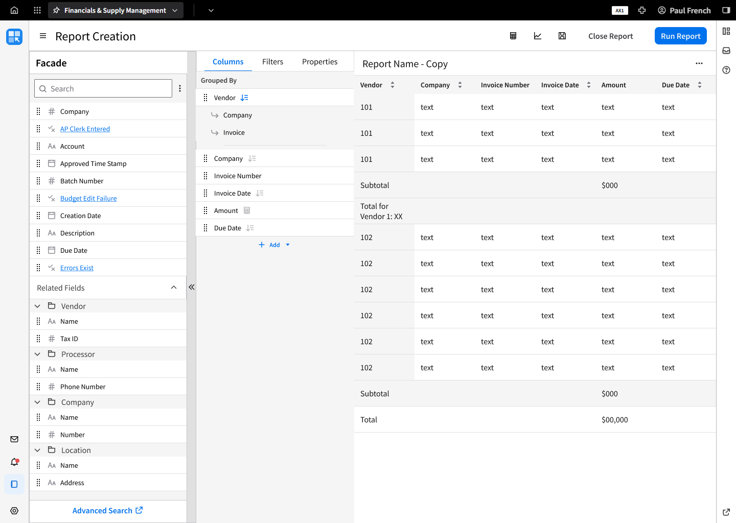
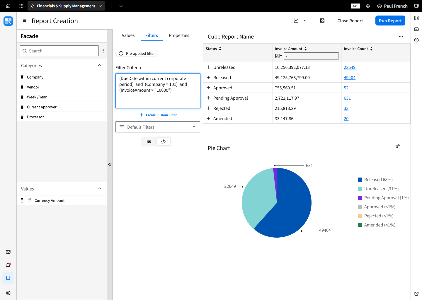
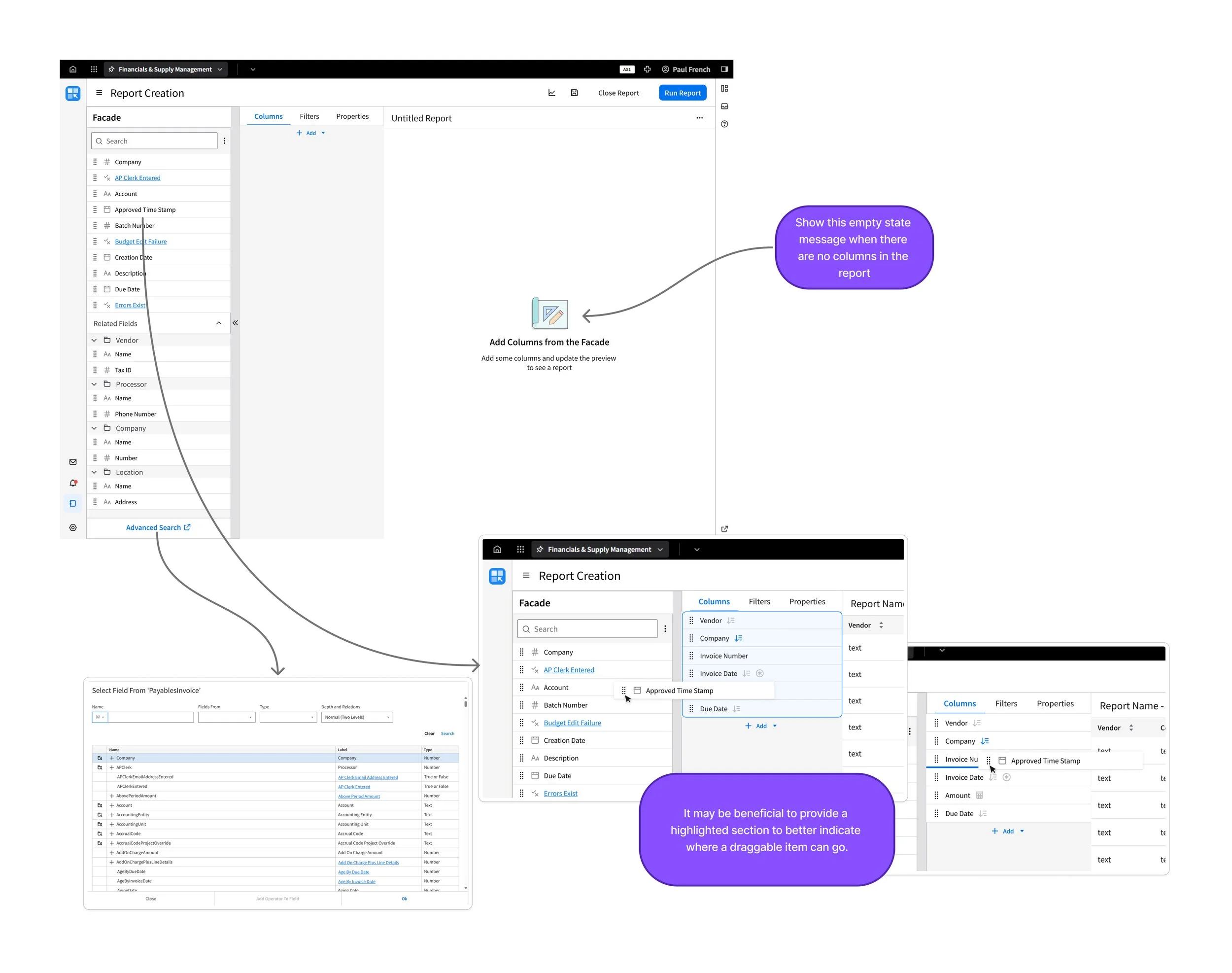
The Builder was the second phase, set to take over the existing report flow once it got more polish. Users wanted to see the report they were building instead of firing blindly and hoping it worked. So you drag fields into a live preview and watch the report take shape as you go. If you grab the wrong field, you see it right away instead of after a failed run.
The Results
This project took the better part of a year, from nailing down technical constraints to a finished handoff to engineering. I left Infor before it shipped, with the Explorer already running in our sandbox and the Builder designs handed off.
The goal was for someone who knows their business, but not our data model, to find their data, see what they’re building, and get a working report without filing a ticket.
What I’d Do Next
I’d get real users in front of the Explorer and time how long it takes them to get to their first working report. I’d also compare reporting-related support tickets from before and after launch. Those two numbers would show whether self-service actually happened.