
Menu Consolidation
A full overhaul of system navigation, from 100+ nested menu items per app down to 9 or fewer categories.
The Challenge
In our legacy system, users were often in the dark. Everyday workflows were split across separate web apps like Payables Manager and Asset Accountant, so finishing a single task meant constantly switching between them. The plan was to fold everything into core apps like Assets and Payables, with permissions controlling who sees what.
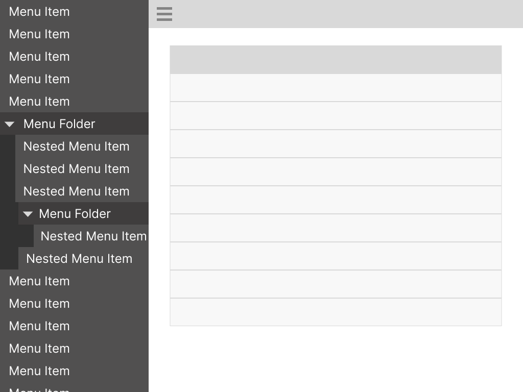
That solved the app-switching, but each legacy app dragged along over 100 menu items buried in a deeply nested tree. Combine a few of those and you've got hundreds of items in one sidebar. This was years of navigation debt, all coming due at once.
My Approach
I was leading this across financial domains where I wasn’t the subject matter expert, so I set it up as two steps. First, I asked each product team to build personas for their app’s main roles and sort every menu item into 9 or fewer primary categories for those people. They knew the domain better than I did, and the limit forced them to make hard calls. The 9-category ceiling gave enough slots for every role while also keeping the menu from spilling down the page.
Second, I worked with our UX research team to run tree tests in UserZoom on the proposed structures before building any final designs. If people didn’t know how to find things there, no amount of visual polish would save it.
Chopping Timber
The tree test results pointed to two main problems. The first was label confusion. Our testers were a broad group rather than subject matter experts, so names that made perfect sense to the product teams didn’t mean much to anyone else. That was a tougher crowd than our actual users, albeit a pretty good stand-in for someone new to the product. The second was dead ends, where people went looking for an item and simply couldn’t find it anywhere in the tree.
I used those results to retool the category names. They also made it clear that some items would need to be findable under more than one name, which shaped how we handled search.
The Hurdle
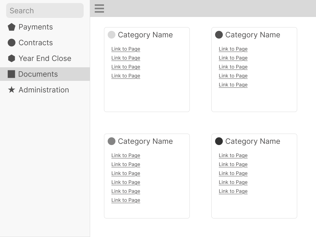
Moving away from deep sidebar trees meant hundreds of menu items needed a clear home on the pages themselves. I didn't want to just move the clutter from the sidebar onto the page. Working with our product owners, I grouped navigation sections by task, so people could find what they needed without wading through everything else. For example, some roles would just have a handful of pages dedicated to year-end tasks, so these could be grouped up into “Year End Close” as a category.
Where’d My Stuff Go?
I had anticipated the inevitable ‘where’d you move my stuff?’, and the dead ends in testing backed it up. I pushed for improved keyword search that covers legacy labels and alternate terms. If someone searches for the name they’ve used for years, it surfaces the right item and takes them to its new page.
The Results
The new navigation shipped, and the consolidation got rid of the constant app-switching for everyday tasks. Every role’s top-level menu went from 100+ items to 9 or fewer categories that had been tree-tested before launch.
Along the way, we worked closely with a core group of clients who were willing to review pre-release changes. They got early previews of the new system, along with the ability to toggle it off if they weren’t ready for the big change. Their feedback on the direction was positive, and their concerns helped us simplify the setup process.
I also wrote the support documentation for setup and edited a short video showing how to enable and configure the new system.
What I’d Do Differently
We never got to run follow-up testing with customers after launch, and next time I’d push harder for it. I’d watch how often people still search with legacy labels, which should drop as they learn the new layout, and whether navigation-related support tickets go down. Moving navigation from the sidebar onto pages isn’t a perfect solution either, so I’d want to hear from end users directly about how it’s working for them.