COVID-19 Tracing App
Creating a tracing app for Minnesota using the Apple/Google API
The Challenge
By early September 2020 I had been unemployed for eight months. To say I was feeling disheartened is an understatement. COVID-19 had shaken the job market to rubble, and the limited UX jobs that did resurface were not tailored to my limited experience. I had spoken with a few good contacts I had made in the UX universe, and one of my big takeaways was that I needed to take some initiative in boosting my portfolio.
I began brainstorming what I would want to create, and I figured what’s better than taking a topical approach and build a COVID-19 tracing app? I had followed the news of Apple and Google joining forces to create a tracing API using anonymous nearby Bluetooth identifiers. At the time of starting this project, only Arizona and Alabama had applications that took advantage of this API. I downloaded and tested Arizona’s app and found that the setup process was very straightforward and informative, but relatively lacking in features. With Minnesotans seeming to get more and more public interaction —with masks, of course— I thought it would be a great idea to improve upon the existing apps and create a custom tailored app for my home state.
Next, I needed a good idea of what people would expect and want out of an app that could possibly give them essential COVID-19 updates and information.
Research
To understand app expectations, I set up a Google Form and sent it to miscellaneous contacts to gather a few responses. Forty respondents later, I had gotten more than enough feedback to get an idea of where to place my focus.
To start things off, exactly half of my respondents fell in the 18-24 age range and three-quarters of all respondents are using iOS. This works out nicely for me; I use an iPhone and planned to design in accordance to Apple’s standards. I now had a good understanding of the demographic I might be working with.
I next asked what features would be most important to them in a COVID-19 tracing app.
82.5% of respondents said an interactive map of testing locations was most important to them.
70% wanted a readout for current case numbers.
65% marked notifications as being important.
App security did not rank as highly, but is an expected inclusion. Security is not user-facing, but I figured I would likely have indications of privacy measures within my prototype.
Some respondents provided features in the free-response “other” section, all very similar in nature. They mainly wanted some form of mapping of positive cases near them and last known businesses that positive cases may have been seen, or even identifying people by name if within your contacts list. Unfortunately, this grossly violates the privacy guidelines set in place by the API. Though helpful, it would not be possible —nor ethical— to use location data in this manner.
Personas

Not only did my survey give me a great idea of the feature set to implement, I also got a pretty wide selection of demographic data. I could select people by age and see what their responses were and really build personas around age groups I felt were most important to this project. Despite the watermark, I found Xtensio to be an incredibly valuable tool in providing a template for my personas. Based on my survey, I opted to create a persona for my largest 18-24 age range as well as one for my upper age groups. Julian Donaldson was meant to capture the always-connected and tech-savvy element of a younger user base, while William Prosser was created to capture an older demographic that might not be as explorative in using software.
What I found most unique about creating personas for this project was having to step back and understand what kind of stance people had regarding COVID-19. All of the people I polled seemed very conscious of mask-wearing even if not required by mandate and had some curiosity in keeping up with case numbers and guidelines. Incorporating a user’s stance on a current event into a persona is something very new to me, but using the data I had gathered I felt like I had a pretty good setup to continue into sketching and wireframing.
Wireframes
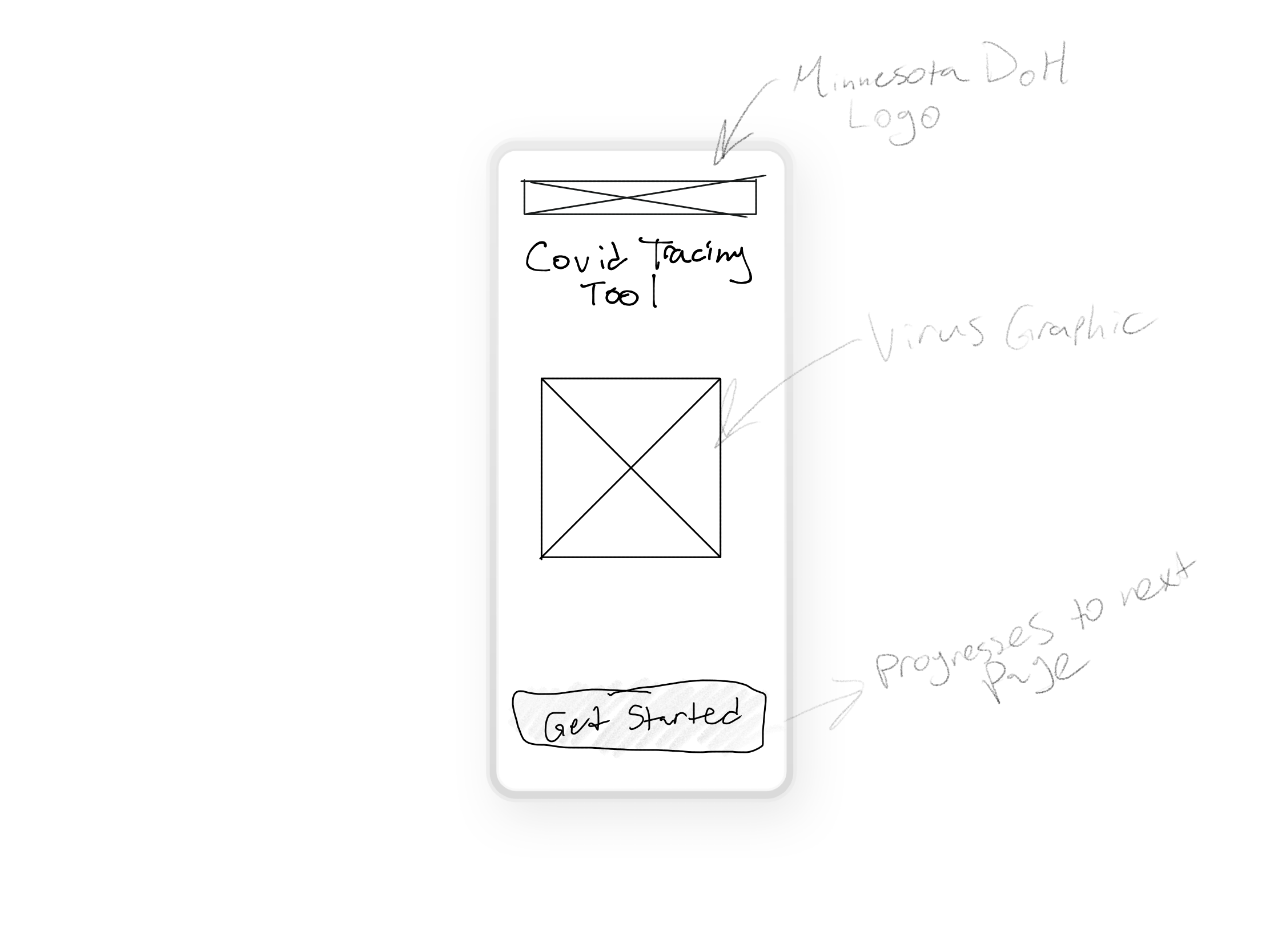
1. Splash screen
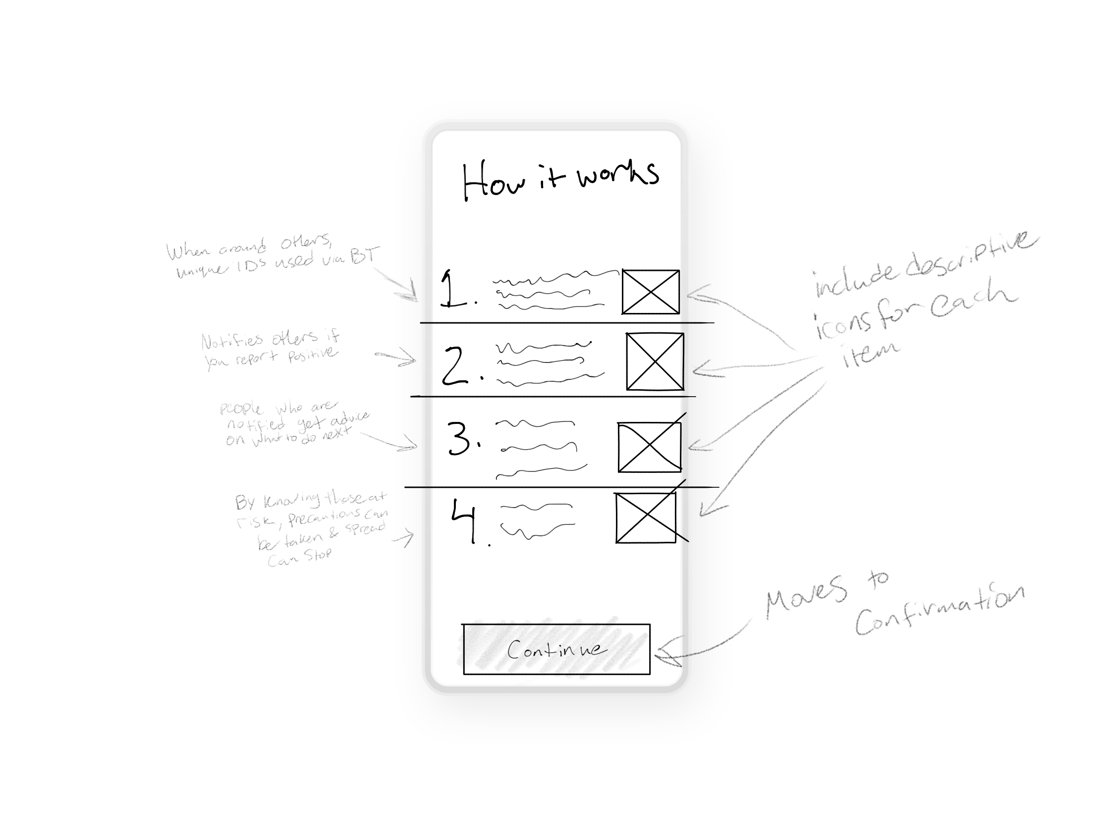
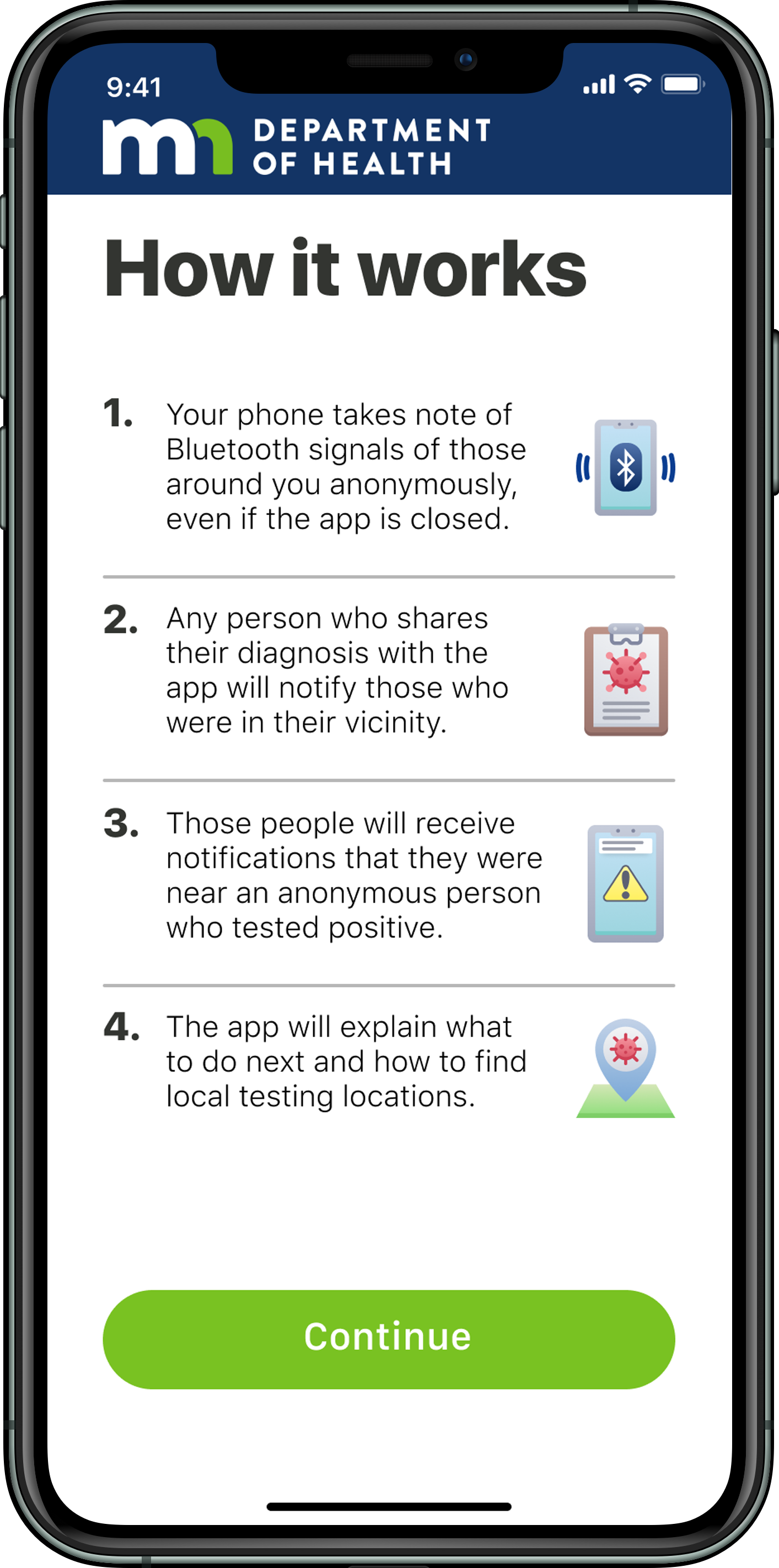
2. How it works

3. Confirm iOS privacy and tracing notification settings

4. Confirmation screen
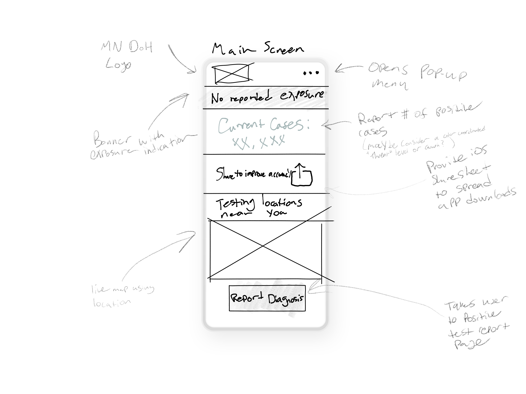
5. Main screen
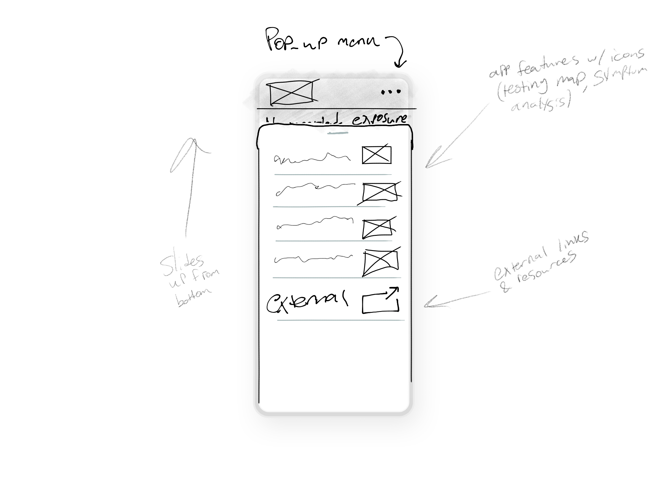
6. Pop-up menu
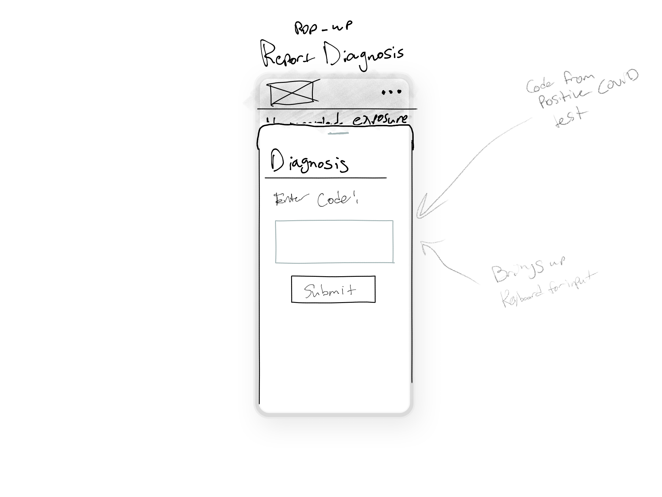
7. Report diagnosis
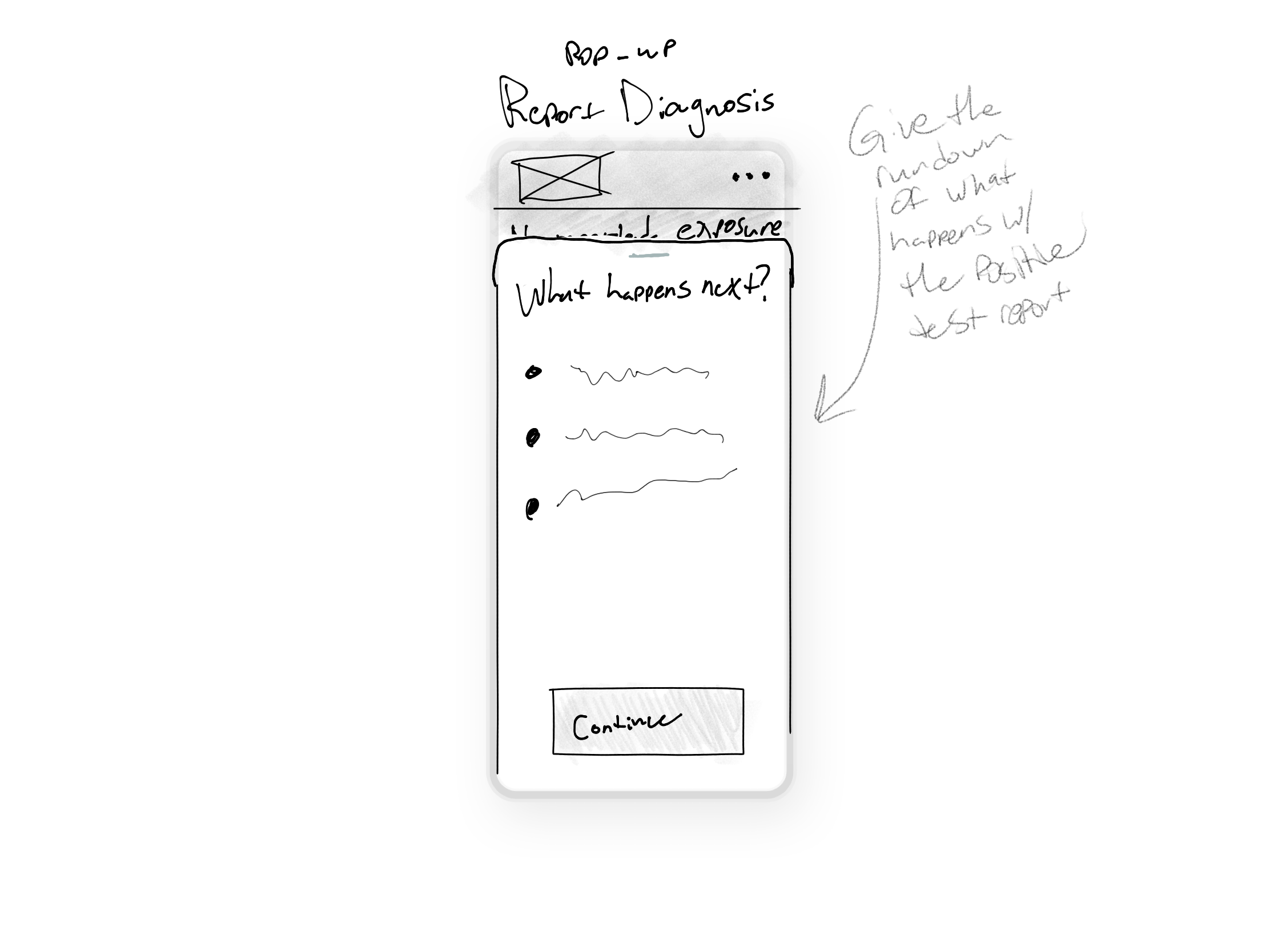
8. Next steps for diagnosis
I was worried about how to approach the layout of the app. I wanted to prioritize setting up exposure notifications and push notification permissions, since this is a set-it-and-forget-it sort of situation for some. The app is only effective for people if they have it installed and set up for tracing. Without allowing those notifications, the app cannot provide much value for users.
Once set up, the app can provide a lot of useful information within the homepage. Current case numbers and testing locations are clearly visible at a glance along with an element to open the iOS share sheet to share a link to the app. The menus are set up in a way that layers them in front of this main screen, keeping natural navigation awareness.
Admittedly, this is one of the first times I’ve truly sat down and wireframed something from scratch, so I know it’s far from perfect. I feel like I’ve learned a lot about how to annotate my drawings and how best to go about getting my ideas across, but I have quite a bit to learn in terms of justifying my design decisions and really creating a good interface from scratch. Regardless, I move forward with these designs as my backbone.
Prototyping
This is where the fun begins. I’ve worked with Figma in the past, but I really have not sat down and learned all that the software has to offer. On top of it all, I think my design skills are a little rough around the edges with such little experience. This was going to be a learning experience no matter what.

“For the first couple years you make stuff, it’s just not that good. It’s trying to be good, it has potential, but it’s not. But your taste, the thing that got you into the game, is still killer. And your taste is why your work disappoints you.”
― Ira Glass
I started simple; I knew it wouldn’t be too difficult to get a good flow for the app setup screens. Basing my color palette around the MN Department of Health website, I made a pretty easy-to-navigate set of screens for users move through. It’s meant to be a fairly simple setup process to get through iOS privacy permissions and inform the user of what the app does. I wasn’t too worried about setting this up in Figma since it’s a pretty natural page-to-page flow. What I was more worried about, however, was designing an intuitive home screen.

My original approach really fell short the more I kept looking at it. Those who I had look at the interface were confused what the “Significant exposure” banner was meant to convey, and overall the page was feeling a bit cluttered with poor use of space. I was unhappy with how much I was losing confidence in my design abilities. Nonetheless, I pressed forward with a little bit of feedback.


Results
My final interactive prototype can be found here. Overall I really feel like I’ve gained a better understanding of my design approaches and what I should place focus on. I’ve spent a lot of time on this design, but I still find myself disliking my own work. One of the biggest issues I found was realizing how much I needed to learn about Figma. Although I felt familiar with the program, I often struggled to figure out how to make some of the more intricate interactions in my prototype. I arguably learned a lot more about how to approach prototyping my next time around, but I still have plenty to learn and improve upon.
I’m glad I spent the time to commit to this project even though the results aren’t perfect in my mind. I’m hoping to build more of an understanding of how to articulate my likes and dislikes when it comes to flow and functionality. Though I think I’ve crossed a lot of the features I hoped to include off the list, I’m not sure my user flow is as intuitive as it could be.
I got my prototype in front of a few users and they all seemed to navigate it just fine without too much confusion. The arguably most important element that people had confusion with was the “Significant exposure” banner. Adding that secondary information bubble made was helpful, but also confusing for some on what to click. I would likely run some more variations in user tests to try and find a more intuitive alert system.
I feel like this project has given me more insight into my process and what areas I hope to improve upon. Instead of feeling defeated in the areas I feel I fell short, I’m very excited to continue to evolve my craft.